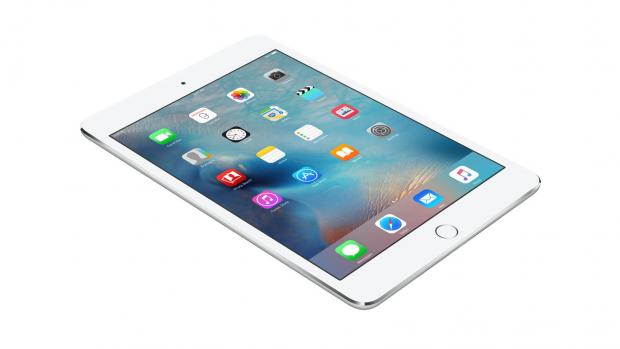
Screen Test on Ipad Mini 4 – Applerepo.com, With iPad Mini 4 were promised better color reproduction and it is true. Compared with the iPad Mini 3 the difference is huge where the fourth version is better in every way and more color accurate. Older Mini models lack the range for red hues and therefore gave pale skin colors which also means that the monitor is not capable of deep red and blue hues. Thus is also magenta, pink and purple tones totally wrong of iPad Mini 3. At first glance, the Mini 4 to see much more colorful like compared to the Mini 3, and that the impression should you trust. Mini 4 gives the right colors. Mini 3 do not give the right colors.
Maximum brightness of the iPad Mini 4 is just over 400 cd / m2 similar to previous iPad models. Minimum brightness is just under 5 cd / m2 which should be low enough for bedtime reading in the dark. The screen is color-wise stable throughout this range. The weaker it shines the less bluish white balance, around 6800 Kelvin instead of 7000 Kelvin color temperature. There is a small difference that can absolutely be measured but which are not directly visible, much less disruptive. You can depend on the colors of the screen no matter how bright you are driving. Again, it is similar to existing larger iPad models.
The ability to climb down the brightness to 5 cd / m2 is also an important difference of the apple ipad mini 4 from the ipad Mini 3, which contented itself with around 8 cd / m2 at the lowest brightness. It is still quite bright for a reading under the covers or equivalent. Now learn most run with automatic brightness active in any case, but it may be worth to know that in case you set the slider halfway through the scale, we reach about 160 cd / m2.
iPad Mini is now similar to other iPad models
IPad Mini 4 is, on the whole, therefore more similar to other iPad models. Compared with the iPad Air 2 is about the same in terms of color reproduction. Both draw something much against blue white balance, and it almost seems to be a little informal “Apple-standard” to aim for 7000 Kelvin, rather than the 6500 Kelvin as the normal white point is located on. Thankfully keep current iPad models balance of red and green and we will no longer see color cast to turquoise or pink. It is slightly blue, but no more.
We step into the color space and measures the iPad Mini 4 sets nuances, it is clear that the slightly blue white balance is the biggest problem. Though the problem is still small in terms of the big picture. When we measure the representation of the standard (and classic) Color Checker colors are the average level of error for 2 (dE2000) which is about the best you can get in other contexts through color calibration.
Even such details as tone curve / gamma are better at Mini 4 with a little clearer drawing of the darkest shades. The difference is not large, but in terms of precision, the Mini 4 slightly better than Air 2.Catchlight filter of the Mini 4 also reminds Air 2 in how it handles the room’s light. The blackness of the angle becomes purple in both models.
Ipad Air 2, by contrast, is still a force in that its panel shuts down its own light better. The contrast ratio of the iPad Mini 4 is about 950: 1 and an improvement on the Mini 3. Air 2 reaches rather a contrast ratio of 1100: 1 and set to the same brightness will then Air 2 to dig deeper into the blackness. This can be an advantage, especially when using the device in the dark and thus can more easily see how the blackness appears as a dark gray background rather than black. There, Air 2, the better the screen.
Now lack sophisticated control or ability to get more precision with iPad (and iPhone). You get the light you get, so to speak. Therefore it is good that the light coming anyway is so good that in other contexts would be classified correctly. Trained eyes can see that the white balance is slightly blue, but that is all. You can pick an iPad out of the box and basically trust that what you see is correct colors. Something that is not all that common in other contexts.
Check Out These Too:
- How to Unlock Disabled iPad without iTunes How to Unlock Disabled iPad without iTunes - AppleRepo, Looking for a solution to unlock a disabled iPad without iTunes? You are here. It annoys you when you get the…
- Apple May Open Stores Inside Target Stores Target is one of the nation’s largest retailers so it’s not surprising that they sell thousands of Apple products every day in every store. Now it seems that Apple may…
- Report: No 7 Inch iPad Next Year Given the wild success of various Android tablets that are smaller than the iPad many analysts began to consider the fact that Apple may release a 7 inch iPad. There…
- How to use iPad Gestures Gestures are simple inputs that can control nearly any feature or function of your iPad and with a little bit of training they can become an incredibly useful tool. Unfortunately…
- Apple Censors Opera Mini Browser Apple’s app store has around 300,000 apps in it at the moment making it the biggest applcation store in the world. However, Apple is extremely picky about the apps that…
- Download Befuddled HD iTunes Application for iPad The vast majority of people enjoy the use of the Befuddled HD on there iPad machine. The application only costs approximately 2 dollars which is a cost-effective investment for the…
- Call of Duty: Zombies Game for iPhone, iPad and iPod Touch Call of Duty: Zombies Game for iPhone, iPad and iPod Touch. Call of Duty doesn’t really need much of an introduction, however Call of Duty: World at War: Zombies (probably…
- How to Fix a Cracked iPad Screen? How to Fix a Cracked iPad Screen? - AppleRepo.com, The most common issue to an iPad is the screen getting cracked, shattered or broken. Apple’s iPad aren’t cheap that can…
- 6 Essentials For The IPad Mini 6 Essentials For The IPad Mini. If you’ve just unboxed your very own iPad mini, or are getting a bit jaded by your latest piece of tech, this essential guide…
- Target Confirms Mini Apple Stores Earlier this week we heard rumors of a potential new endeavor from Apple which would essentially create mini Apple stores inside of Target stores around the country. Today we have…
- What Makes the iPhone and the iPod Touch Such… Part of what makes this electronics so popular and everyone wants to have them is because of all the things that can be done with them. There are the applications…
- Make a Trip to an Underwater World with Promini iPod… Promini iPod Touch Game. What are you doing right now? Need some assistance in spending time in a fun way? Here's a hint! You can play Promini iPod Touch Game…
- iPad Screen Shaking Issue iPad Screen Shaking Issue - There are different ways on how your iPad’s screen could shake. It could look like you are doing a lot of touches and tapping. Some…
- Easy Solutions For iPad Mini Freezing Easy Solutions For iPad Mini Freezing - www applerepo com, No matter how expensive, current or advanced your gadget is, just like every other technology in this world, it can…
- Projector for iPhone Best Projectors for iPhone - There are many reasons why you might need a projector for your iPhone. For example, if you want to watch a movie at home or…
- True Tone iPhone True Tone is a feature that first appeared on the iPhone 8 in 2017 and continues to be embedded in Apple phones to this day. This feature allows the iPhone…
- Case Crown iPad Cases We've already brought you some of the great iPad cases that are out there, but Case Crown has also released several lines of cases that are not only stylish, but…
- Four Popular IPhone 4 Cases Get Reviewed Popular iPhone 4 cases. You are the proud owner of the new iPhone 4, but you are needing a case to fix that antenna problem. The front and back are…
- How to Remove a Configuration Profile from an iPad or iPhone Tips to delete Configuration File on ipad or iPhone - AppleRepo.com, You can remove a configuration profile from an iPad or iPhone either by using iPhone configuration Utility or directly…
- 4 Essential IPad Accessories For Style, Protection… Essential IPad Accessories For Style, Protection And Functionality. Your iDevice cost you a pretty penny, so you always take care of it to keep it scratch and smudge free. Fortunately…
- HOW TO DELETE CYDIA FROM YOUR IPHONE Once you've jailbroken your iPhone, you can use it to download the Cydia apps and cydia games then use the app to install other programs. Many users say that Cydia…
- Can Heat Damage Your iPod Touch, iPad or Your iPhone? iPhone, ipod touch or ipad heat damage - AppleRepo, Many people know that water damage is just about the worst thing that can happen to your ipad, iPod Touch or…
- The Impossible Test iPhone Answers Impossible Test iPhone Answers. Want to take the impossible iPhone test? Well, if you do and you don't know how to get it on your phone, first download it here.…
- Twitterrific iphone App Review - Free Download from iTunes Twitterrific iphone App has a category of social networking and has one megabyte size. You’ll be able to twit anywhere, at anytime or in a constant basis, bothering your follower due…
- Apple See’s Huge Profits but Shares Fall Apple, the company behind many popular electronic devices including the iPhone and the iPod Touch devices has seen a huge boost in profits. The company posted their results for the…
- Branson and Murdoch plan Publications for Apple iPad The Apple iPad has become one of the best ways to read digital content these days and there have been a variety of magazines and newspapers that have launched in…
- Rumors are the Apple is set to Release a Bunch of… Apple wasn't happy enough with the release of the iPad early this year, with the release of the iPhone 4 not much later in June. Now they've stirred up rumors…
- Things to Consider Prior to Buying the New iPad Tablet It is factual when they say the latest iPad Tablet device from Apple is integrated with lots of stimulating and useful features. By the time it was officially publicized, a…
- 3 Best Writing Apps for the iPod Touch Have you ever tried to write something on your iPod Touch? Whether you're a professional writer, like to just jot down lines of poetry when they come to you, or…
- Flash Player for iPad Flash Player for iPad We all know that Apple does not allow Flash player for iPad, iPhone or iPod Touch. However, there is a way to get Flash on the…